Creating pieces for digital campaigns has become a significant part of any designer’s job, but knowing how to design for printed materials is still an important tool to be a well rounded designer. It isn’t as easy as just opening a social media graphic and hitting print. You need to take into consideration how the colors will translate from web to print and if the graphics are even the right resolution to be used in a new medium. Below we’ll discuss the different color modes used digitally vs print and the resolutions needed for each.
Color Modes
There are a few different color modes you need to consider when you’re making a design work digitally and for print. The main two that come into play are RGB and CMYK, but you’ll likely hear of HEX and PMS. While the two latter are not necessarily color modes, they’re often thrown into the mix when discussing digital and print applications. Let’s start with the two that are used for digital displays.
RGB and HEX
The most common color mode people are aware of is RGB (Red,Green,Blue). When a pixel is brightened with different combinations of these three colors at different intensities, it can create just about any color. The values start at 0 and work their way up to 255 for each color. So if you want to make a yellow using RGB, for instance, you’ll use the values (235, 235, 36). The more light you add to a color, the higher the number until you get to white, which brings the values to the highest they can go (255, 255, 255). On the other side of the spectrum, the less light you use, the blacker the pixel, (0 , 0, 0). Each number corresponds with their respective color.
A HEX code works similarly to RGB in the sense that it uses those same three colors to call specific values. The difference is how those values are calculated. For instance, the same yellow mentioned above, (235, 235, 36) can be created with the HEX #ebeb24. You’ll typically see both codes in a style guide, as HEX is usually referenced when using your brand colors on your website more often than the exact RGB values.
RGB is able to produce a wide gamut of colors, so you are able to produce some very bright colors, such as neon green or safety orange.
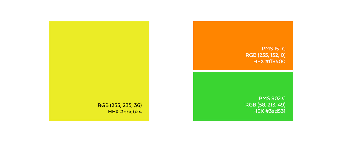
You can see just how vibrant colors can be on displays.
CMYK
In the print world, CMYK is the go-to for color values. CMYK (Cyan, Magenta, Yellow, Black (or Key)) breaks down the values into how much ink should be used to create the desired color. If you’re looking for a rich black, you’d use the value (0,0,0,100). Unlike RGB, the higher the numbers, the more of that color will be added.
CMYK’s gamut is also much more restrictive compared to RGB. The colors mentioned earlier, neon green and safety orange, are not nearly as reproducible using ordinary CMYK printing methods. They’ll come out much duller once converted. In those cases, you’ll need special ink in order to produce them.
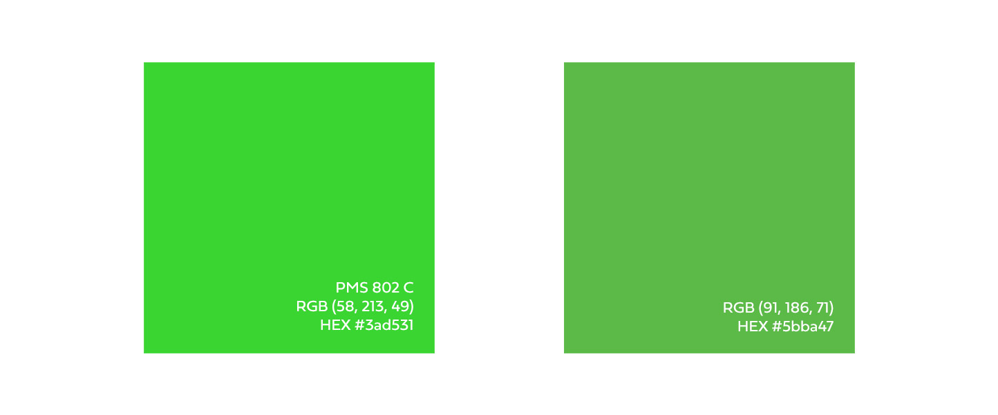
Using the RGB equivalent to PMS 802, we converted it to CMYK then back to RGB. The original RGB color was severely dulled when converted over.
PMS
A must for any brand is predetermined PMS (Pantone Matching System) colors. Pantone has built an extensive list of colors that correspond with a number that a business can reference when asking for something to be printed. The printer can then refer to their swatches to see what mixture needs to be used in order to replicate it. This system allows for a consistent representation. They even have the ability to create uncommon colors such as the aforementioned neon green.
There are a couple things to know about using Pantone colors, though. First, because not all monitors produce colors the same, matching a Pantone color with what you see on your monitor won’t be completely accurate. Sure, Pantone offers RGB and HEX values in their Color Bridge, however that still doesn’t mean it will look accurate to what you see on your screen versus what you see in a physical swatch palette. The second is that not all colors can be accurately produced in CMYK. Due to that limited gamut, CMYK can’t produce the exact same pigments that matches the swatch. In that same Color Bridge, you can see how closely you can actually get to match the PMS color of your choice using CMYK.
Resolutions
Have you ever downloaded an image off a website and tried printing it out, only for it to be a blurry mess? That’s because its resolution is not high enough to be produced in the quality needed by your printer. In order to understand why that is, we need to discuss DPI/PPI (Dots Per Inch/Pixels Per Inch). These terms refer to the number of dots within a linear inch and help us understand the quality of the image. The larger the number, the more dots (or pixels) can fit into that space, allowing for more details.
Digital
When you’re planning to use an image on a digital display, in most cases, 72ppi will be enough. You could use a higher number, if you’d like, but that just means a larger file size and longer load times. Keep in mind that 72ppi is just one part of the package. If your graphic isn’t large enough in actual dimensions, you can’t simply scale up without resulting in a loss of quality.
If you’re planning to use a design for print, the most common and recommended resolution is 300dpi, which will allow the most clarity. Anything larger will just add to the file size and may give you some weird results. But in most cases, it won’t make the graphic any more crisp.
When you’re working on a massive print, such as a billboard or event banner that will be seen from a great distance, you can get away with a smaller DPI like 150. Otherwise the file sizes can be so large you might not even be able to edit them properly. The quality of the image can be somewhat compromised because of the distance at which you’re viewing it. No one is getting up close and personal.
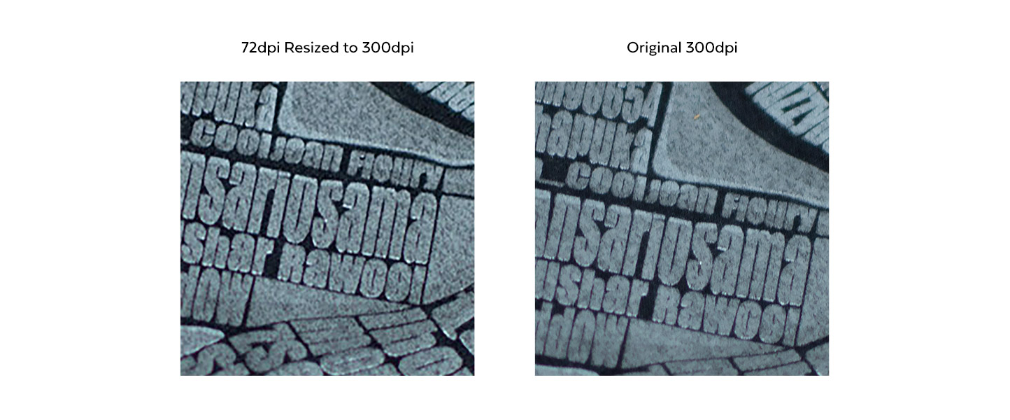
When a graphic is scaled from 72dpi up to 300dpi, Photoshop tries its best to add detail that wasn’t originally there. Sadly this leads to an image that is in this case overly saturated, grainy, and lacking overall quality.
Conclusion
So, there are a few things to keep in mind when you’re creating for digital vs print.
- Digital/Web
- Color Modes – All your files should be set to RGB. You can use either RGB values or HEX codes to determine your colors. If you are working with your company’s PMS color, there are Pantone provided values to mimic that color as closely as possible, but remember that every monitor interprets colors slightly differently. So it may not match exactly to what your colleagues see or even what you see in a physical swatch.
- Resolution – To make sure your files aren’t too large and display properly, have them set to 72ppi. Anything larger is typically unneeded. But remember, you still need to make sure they’re sized properly. a 10px by 10px graphic can not be used in a 50px by 50px space without being blurry. Either use a larger graphic to begin with, or if you can, use an SVG.
- Print
- Color Modes – Make sure all of your colors and images are set to CMYK. If you’re trying to match a PMS color, use the Pantone suggested values.
- Resolution – When you’re having things printed that you’ll be able to get close up with, use images that can be displayed at 300dpi. This will give you the clearest results. If you’re creating something for a large billboard, you can likely get away with 150dpi.
Even if you’re a digital designer, it’s always good to know how to design in print as well. Keep these details in mind when you’re working on your next project.