If you ask someone what a brand (or visual) identity is for a business, they’re most likely going to say it’s the logo, obviously! Well they’re partially right, but it is so much more than that. Your brand identity encompasses all of the raw elements that represent your business. This includes your logo (obviously!), but also the color scheme, typefaces, and various supporting images. Let’s break these down a little further into what exactly they are and what kind of advantages they provide to a brand.
Logos
The term “logo” encompasses a wide range of categories, including mascots, symbols, wordmarks, and more. Here is a small breakdown of a few of the categories:
Mascot: An illustrated character. They can be a human, animal (anthropomorphized or otherwise), or even something otherworldly. KFC, Chuck E. Cheese, and Michelin all come to mind when talking about iconic mascots.
Symbols: This is probably more along the lines of what most people think of when logos are mentioned. They are typically a single graphic that becomes the fixture of a brand. Think Nike, Apple, or Target.
Wordmarks: Just like mascots, it is in the name. They are logos that include the full name of the company. Some famous wordmarks include Coca-Cola, Google, and Facebook.
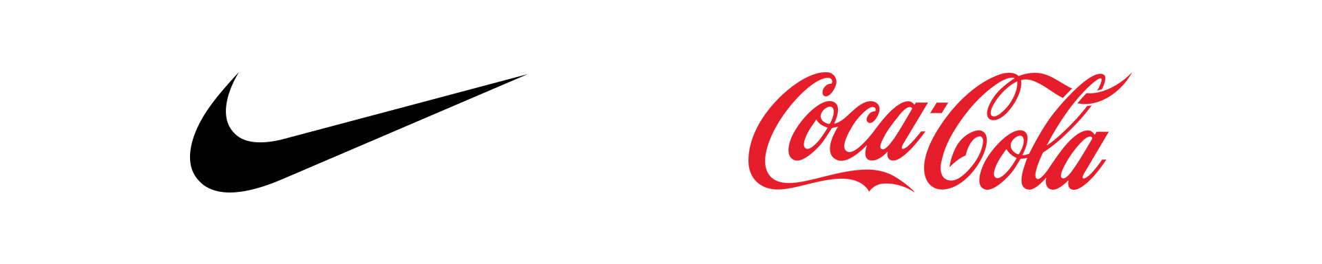
Nike’s Swoosh symbol (left) and Coca-Cola wordmark (right)
A logo is the face of your startup. It is used on everything from applications and merchandise to your social media profiles and advertisements. Having a professional logo allows for your customer to understand and recognize your business from just a glance. You should always use the same logo, whenever possible, to help build brand recognition. Variations in color and layout of the logo should be developed for when the need arises.
Color Scheme
Colors evoke a powerful reaction and can make a photo or graphic even more impactful. Choosing the right colors, and using them consistently, allows for the audience to build a familiarity and have a recurring emotional response.
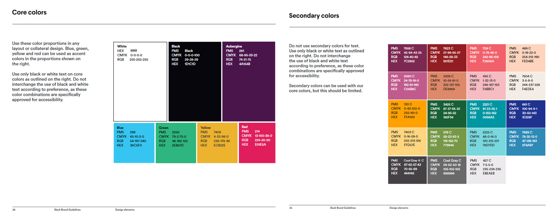
Slack has examples of their “core colors” as well as secondary colors. They give descriptions of what they should be used for.
Usually a color scheme is set up with a hierarchy/tiered system. There are the main colors that are typically used within the logo. Then we have the support colors, which can be used in headers, subheaders, support graphics, etc. All of these colors are selected to work in harmony with one another.
Typefaces
When an audience looks at a website or brochure, they may not immediately realize that even the typefaces are branded. However, when building your visual identity, you want these typefaces to coordinate with each other and your brand as a whole in order to serve their purpose well. Some fonts or font weights (regular, italic, bold, black, etc.) are made for emphasis and can be chosen for headers, for example. There may be another you only want used for short copy, while you have one designated for paragraphs.
Supporting Elements
This term may seem a little vague, but that’s on purpose. Supporting elements can be a variety of things, but mainly they are graphics, photos, animations, etc. that are created to support your logo and branding. They should be used on your website, app, and marketing materials. If you have a mascot, this may refer to having different illustrations of your mascot in various poses.
Whatever elements you have, make sure they were made to support your logo and help drive home the same message.
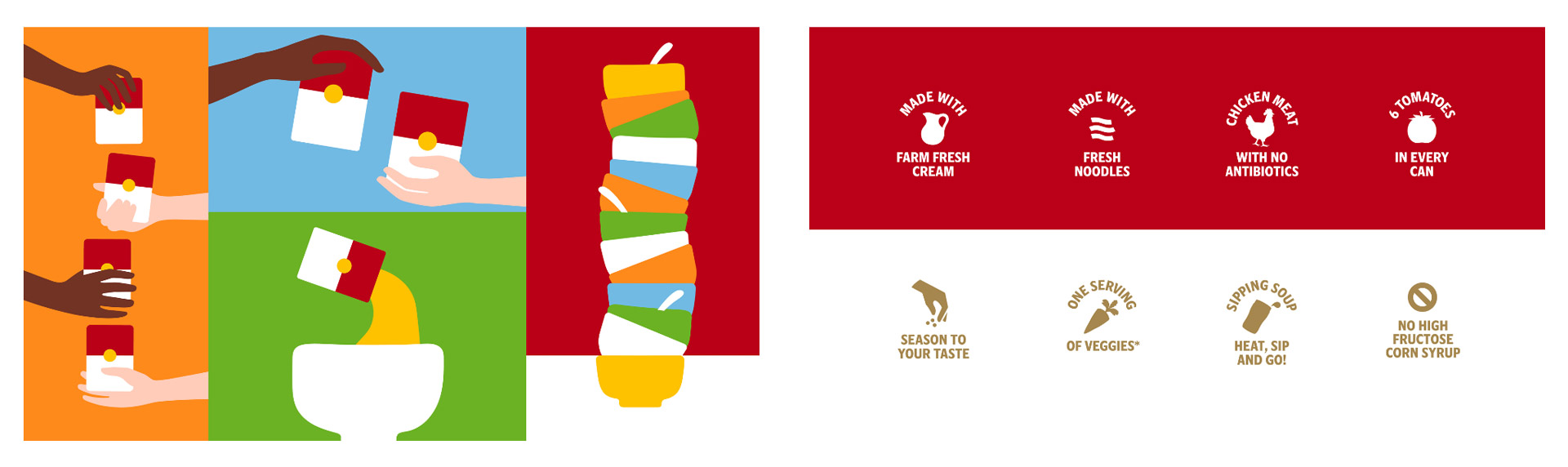
Campbell’s had distinct illustrations created when they rebranded in early 2021. They also have a specific style for their graphics on cans.
Style Guide
Lastly, we have our style guide. This is a document or even a website that includes all of the information we outlined above (and in many cases, even more!). If you’re unsure how something should be used, such as a font or color, you should be able to refer to your style guide and make sure you are keeping within the same guidelines.
Everything from clear space around your logo, branding do’s and don’ts, and uniform guidance can be found in the style guide. New employees, contractors, and even you can refer to it to know how to make sure your startup stays on message no matter what.
Harmony
There are a lot of things to consider when you’re first building out your branding, but without a strong visual identity, it is easy for everything else to fall flat. If your logo, color scheme, typefaces, and supporting elements flow together and strengthen each other, then you’ll start off with the right foundation when you’re trying to grow and raise capital. I would recommend making sure you have all of these items in place before even thinking about developing the next few parts of this series.
Next – we’re moving on to physical items that can make up a brand.
All rights to the graphics in this blog post are owned by their respective company. Abuv, LLC claims no rights to them.