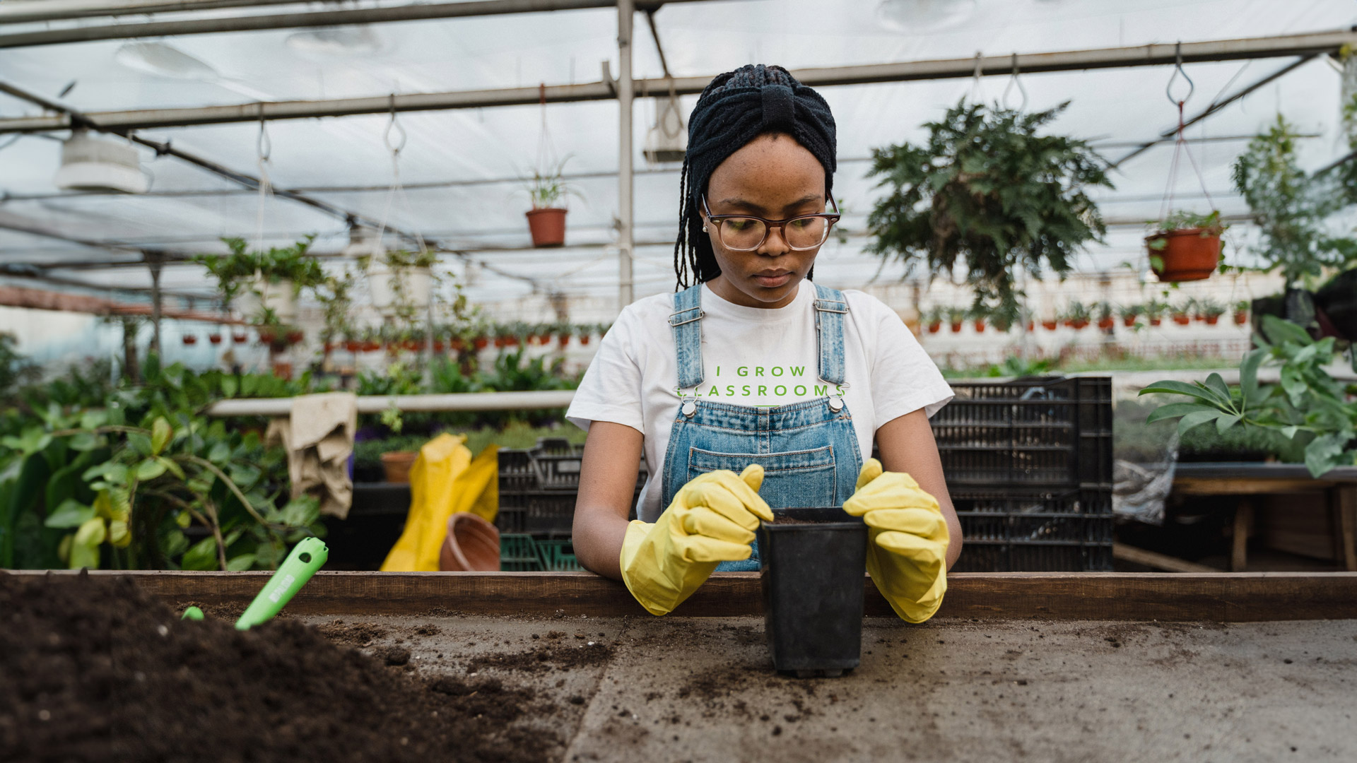
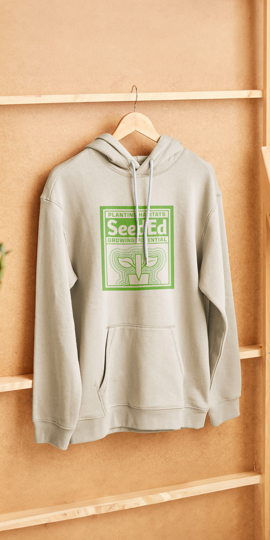
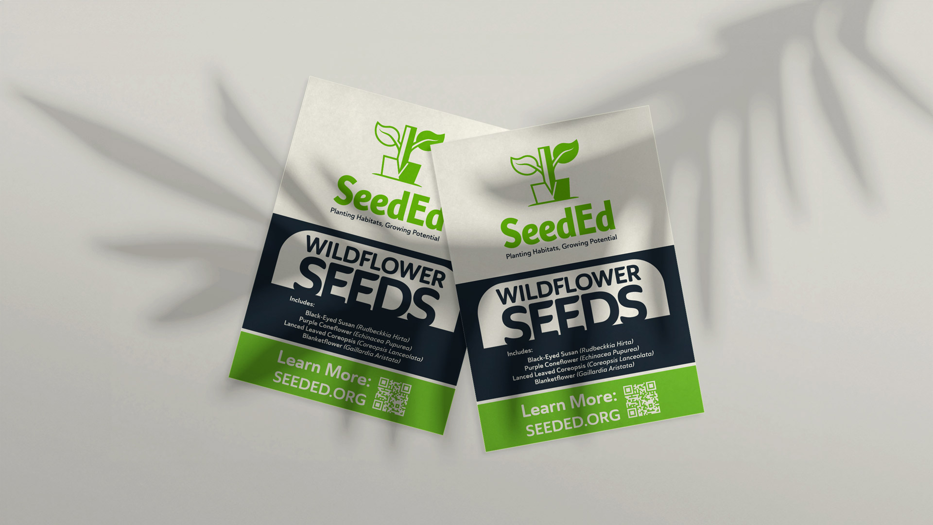
SeedEd is a budding non-profit focused on empowering students and teachers through hands-on outdoor learning. The branding is centered around a simple and bold symbol that was developed for children to easily recognize and recreate. It includes SeedEd’s three branches: Development (shovel), Education (pencil), and Preservation (leaves). Continuing on the same theme and focus, we incorporated bold colors, simple shapes, and friendly fonts to further reinforce the organization’s commitment to education and the environment.